The big new feature for Beru is the cover view, which gives you a much more visual way to explore your collection. But not all Epub files contain covers, so we have the synthesize them when they don’t. If all the covers we make look the same, it would defeat the purpose of the cover view, so my plan is to choose colors for the covers that vary in hue, but are otherwise similar. How hard could that be?
Let’s start with pure colors. The numbers across the top give the fractional components of red, green, and blue.
| (1,0,0) | (1,1,0) | (0,1,0) | (0,1,1) | (0,0,1) | (1,0,1) |
The first thing we notice is that the additive secondaries (yellow, cyan, and magenta) are all much brighter than the primaries. A bit of thought shows that this is obvious: The yellow colors contains as much red and the red color plus as much green as green. Of course it seems brighter. But if we cut each of the components in half for the secondaries, we should get the same brightness.
| (1,0,0) | (0.5,0.5,0) | (0,1,0) | (0,0.5,0.5) | (0,0,1) | (0.5,0,0.5) |
Or not.
The problem is that there is not a linear relationship between the input value x and the intensity of light I produced by your monitor. Instead, the intensity is governed by gamma correction which says, roughly speaking, that the intensity scales with the 2.2 power of the input: I = x2.2. So instead of yellow having an intensity of 2 × 0.5, it actually has an intensity of 2 × 0.52.2 ≈ 0.44. To fix this, we should actually be giving an input of 0.51/2.2 ≈ 0.73 to the secondary colors, so that the intensity of light is the same as for the primaries. (The linear RGB components are given in roman, the gamma-corrected values in italics.)
| (1,0,0) | (0.5,0.5,0) | (0,1,0) | (0,0.5,0.5) | (0,0,1) | (0.5,0,0.5) |
| (1,0,0) | (0.73,0.73,0) | (0,1,0) | (0,0.73,0.73) | (0,0,1) | (0.73,0,0.73) |
That’s looking better. The secondary colors have about the same intensity as the primaries.
But if you look more closely, you’ll notice that the primaries don’t appear to be the same brightness. The green looks brighter than the red, which in turn looks brighter than the blue. This time the problem isn’t your monitor, but your eyes themselves. Human eyes are more sensitive to green light than to red, and least sensitive to blue. Thus, we don’t want all the colors to be the same intensity, we want them to be the same luminance. Denoted by Y, the luminance is a linear combination of the red, green, and blue components that attempts to counterbalance the eye’s sensitivity. The correct coefficients to use depend on the spectra of your red, green, and blue sources. With my eyes and my monitor, I get a better result by using the Rec. 601 coefficients for luma, rather than the sRGB coefficients. So for the purposes of this demonstration, we’ll define a luminance as Y = 0.30 R + 0.59 G + 0.11 B. Let’s adjust the colors so that they all have the Y = 0.30, the same as our pure red.
| (1,0,0) | (0.34,0.34,0) | (0,0.51,0) | (0,0.43,0.43) | (0.21,0.21,1) | (0.73,0,0.73) |
| (1,0,0) | (0.61,0.61,0) | (0,0.74,0) | (0,0.68,0.68) | (0.50,0.50,1) | (0.87,0,0.87) |
Well, they’re all the same brightness, but they’re still not “equal”. That red is much more red than the green is green or especially the yellow is yellow. In all of our focus on the perceived brightness of the colors, we’ve neglected to ensure that they’re all equally colorful. One measure of this colorfulness is the chroma, defined as the difference between the largest and smallest RGB values. Our red swatch has a chroma of 1, but all the others have lower chromas. (The yellow is a paltry 0.34!)
So instead of just considering several hues for a fixed luminance, let’s consider both hue and chroma.
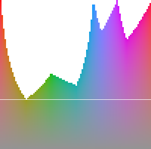 What’s with all of those missing areas? Those are regions that are out of the gamut of the RGB color space. To get colors in those regions, we’d need component values greater than one or less than zero (or both), which we can’t have. The colors above were chosen from the edge of the gamut, giving us wildly different chromas. If we want colors that are equally bright and equally colorful, we need to take a horizontal line through the gamut. If we use that white line, we get these colors:
| (0.53,0.20,0.20) | (0.33,0.33,0.01) | (0.11,0.44,0.11) | (0.07,0.40,0.40) | (0.26,0.26,0.59) | (0.49,0.16,0.49) |
| (0.75,0.48,0.48) | (0.61,0.61,0.10) | (0.36,0.69,0.36) | (0.30,0.66,0.66) | (0.55,0.55,0.79) | (0.73,0.44,0.73) |
There we go: equally bright and equally (un-)colorful colors. Because if the restrictions of the RGB gamut, we simply cannot have high-chroma colors for all hues for a fixed luminance. For making book covers, I think that’s perfectly fine. But if you need something with more colorful colors, you’ll need to give up the constant chroma and/or constant luminance restrictions.
If you want to play with these things, check out the playground I made while learning about these things.